Monday 23 February 2009

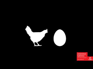
The Chicken is the Egg


Absolutely love this kind of simplistic illustration, it is also so clever and simple using basic icons. It reminds me of The Economist style ads.This is by Ogilvy and Mather, so nice. The debate between a 'glass being half full or half empty' and 'the chicken or the egg' will provide, constant and endless debate which reflects perfectly with the copy line- unlimited talk time.

Friday 30 January 2009

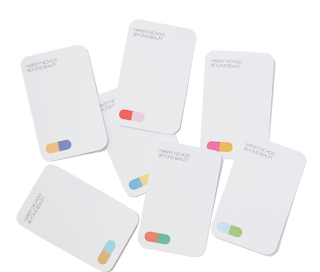
Harvey Nichols


I really admire the simplicity of the branding for the Harvey Nichols Beauty Range by Farrow Design. I love the use of white with simple colour. Colour really inspires me, how colour can convey different emotions/ moods.

The work on the website has a very unique consistent style yet every brand has a different approach to the concept. The work is fairly simplistic which I really like.

Thursday 29 January 2009

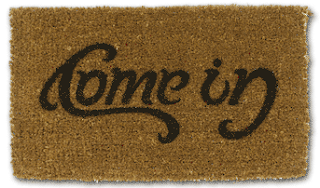
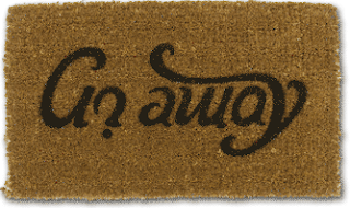
Welcome Mat


Cleverest bit of typography I have seen, just love the quirkiness, and the font is also beautiful. Its been around a while now this design, after I first saw it on suckukbut design on something like a doormat is more important to my research now as I am looking at items to do with home and comfort for the Lloyds TSB Ambient Media Brief. I am wanting to produce things like doormats wallpaper and photoframes.

ABC 3d


This is such a beautifully and cleverly crafted book, the paper folding and technical parts are incredible, producing a letter by each turn of the page with moving elements, flip over pages and pull out folds. Created by Marion Bataille-Illustrator.

Wednesday 28 January 2009

Type Environment


This won a typography award, in the Chip Shop awards. I love the execution of photographing type in the environment, ironically on library shelves.

Friday 5 December 2008

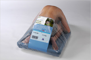
Human for Sale


Brilliant execution of an idea, not sure what its for or where its from just thought clever, clever.

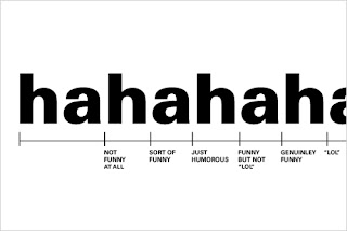
Ha Ha Ha


Me and my friends often discuss in what way we express a laugh through text messaging, i don't agree with 'lol' i put 'ha' but many think that doesn't convey a very sincere laughter.
I ffffoundthis and thought it was so amusing that someone else has thought to measure the effect of the word 'hahahaha'. Nice little piece of type/infographics.

Wednesday 3 December 2008

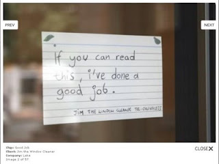
More Chip Shop Awards


You know the feeling when you see something and just wish you had thought of it yourself, this exactly how these two Chip Shop Award finalists made me feel. Such simple ideas that requires little design or execution, just the right context and just works amazingly. I don't have the most creative talent so stuff like this inspires me so much, its not unreachable.

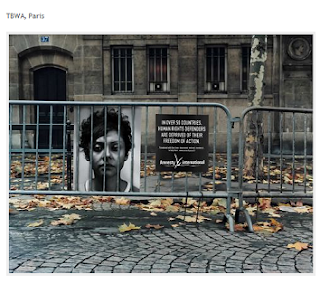
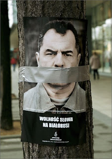
Amnesty International


This just shows the impact ambient media can have, depending on its placement and use of existing materials. This range of ads won an award at the Chip Shop Awards, which showcases creative talent without limits.

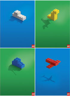
Creative Advertising


This ad for lego is so creative and simple, no need for too much copy or explanation just simple and bold use of colour.

Was pictured in Creative Advertising, brilliant source to fuel so many ideas. Also really like the layout of the book which I may borrow elements from as it suits my kind of design.

Tuesday 2 December 2008

Presentation


The trend in our class for presenting work is the 'grafik magazine' style of holding it up to your face, i want to present my work in this kind of way yet more original, although, i love this layered effect which would be good for a front cover of my porfolio, layering all of the pages, just thought it was a nice piece of photo collage.

Saturday 29 November 2008

I love Type


Always on the look out for hearts, this jumped out of the page, think its quite amusing to use a coronary heart a a replacement to the generic love heart, which i am so indepthly decoding for my dissertation.
The process for designing fonts and laying out type is very complicated as is the parody of coronary artery.

Thursday 20 November 2008

Sony Ericsson


This clearly identifies one of the points i am raising in my dissertation, that the heart logo is so iconic and internationally known that the symbol doesn't even need to be present. Sony Ericssons logo is often used in this way for for there advertising. I like it, its simple and requires no other words.

Monday 27 October 2008

Liverpool One ♥


Whilst visiting Liverpool for the Bruno Maag lecture we briefly passed through the new shopping village- Liverpool One. The shops were incredible, beautiful new shop fits and there was a real buzz in the area.

I, for one obvious reason love the logo. Represents 'the heart of the city' i think its clever and simple and creates a strong recognizable brand. I am using this logo as an example in my dissertation, how hearts can be used for branding places, just like the I ♥ New York logo

Saturday 25 October 2008

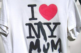
I love my Mum


I love the quirky take on the I love New York t-shirt, this kind of witty 'graffiti' makes me chuckle and always think, 'i wish i'd thought of that'.

Tuesday 27 May 2008

T-Mobile


for my communication brief iv chosen to look at going back to basics with communication and using the tin can telephone also refered to as the 'lovers telephone'. i found it to be an appropiate style that i could apply to a tmobile advert usiong their slogan simply closer. above is a mock up of what i am hoping to produce for the poster campaign.

Sunday 25 May 2008

Add to the Magic


this advert for magic fm is so beautiful, it is a similar concept to what i want to produce for an element of designed identity. by uploading images of what you love to create a book or short animation or simply a directory that people can look at. This is the group i have created on facebook http://www.facebook.com/group.php?gid=15140101129

Wednesday 21 May 2008

Nice Phone


Love this kind of image making it is a really inventive way of displaying a phone for an advert, using the old types of recording methods etc. It is the kind of imagry i would like to produce for the T-Mobile ads. Plus the phone lives up to its amazing advertising.

Monday 19 May 2008

Tek 33

amazing exhibition and lecture at college. sweet tooth and tek 33 and cyclop all graffiti artists, an outstanding collection of work absolutly loved it.

i think after seeing this iv come to realise that i may not after all be so interested in the actual typography but more the body copy itself, like the economist ads, its not the font or layout that inspires me but the philosiphal language and quirky messages.

Wednesday 14 May 2008

Samsung ad


this advert totally encompasses my everyday life, the excitment and pleasure i get from seeing a heart whereever i go and sending them to my mum and loved ones, my designed identity project is focusing in on hearts and this is just a beautiful song, the track isnt too bad either. i <3 the macabees x

Photo Collage


Bridlington was the best day ever! took these set of photos in hope to use them for something soon. Looking at work like David Hockey inspires me to make more complex collages.

this is another panoramic shot in hyde park, im thinking of producing a postcard/ poster to advertise the student life in leeds, there is nothing better than the festival like atmosphere in hyde park!!

Tuesday 13 May 2008

Evian?


So simple yet so effective, its one of those tiny pieces of graphics that you wish you'd seen first. Its right in front of you and so clever, i have been looking into ways of using cardbox box icons to create messages, but there is nothing quite as ironic as this piece of design from a beautiful book- Picture Poetry.

Thursday 13 March 2008

Pysop

i love their catch phrase which they have also made into a personal anthem....
PERSUADE, CHANGE, INFLUENCE.
(which was sneekily stolen from the US governments psycological division)
Again their clientel is remarkable- from adidas to coca cola, HSBC, Mc Donalds, mastercard, nike , mercedes, and starbucks.
they create print, animation and branding campaigns

i love this ad for adidas, firstly the way it is shot is fantastic but the use of spot colour is truely beautiful and a process i like to use myself to highlight special elemts to my design and ads a different element to black and white photography.

Wednesday 12 March 2008


The economist ads are so simple, obviously very effective and instantly recognisable. i love the simplicity to design and the wit of the idea, this is copy at its best, for my D&AD work i could only hope to produce a piece of copy that works so simply as this. They have recently rebranded with a more illustrative style maintaining the colour scheme but i dont feel the approach is as successful.

Thursday 28 February 2008

CV


Im looking to design my cv, i want it to be simple yet creative obviosly as it is a creative cv, i want it to show my passion and place in the design world, combining digital and handmade elements. here is an exaample of type that i liked on handmade stock from '1000 typographic treatments' possibly the best book ever!

Wednesday 6 February 2008

AMV

i really appreciate the approach they have to creativity its not 'fantastically philosophical' as they so beautifully put it, simply to get the product out there- simple. They are the top performing uk agency in the international creativity awards.
They have an absolutly outstanding client list, with a wide ange of target audiences and subject matters to deal with.
bbc, bt, the economist, gillette, sainsburys, motorola, pepsi, royal mail, walkers, rac and volvo.

Below are some of my favorite press ads.
I admire the simple art direction and witty use of copy.

the website is well worth a look at too, you'll be surprised at the different ads they have produced but the format is just beautiful and very me- brown paper, masking tape, postits and used train tickets. cant beat old school design.
www.amvbbdo.com

Saturday 5 January 2008

Monday 26 November 2007

GTA Coca Cola Ad.


Saw this at Pictoplasma, Berlin.
i appreciate the graphics so much as it is simulated to look like the playstation game.
but what catches my attention the most is the reversed scenario of the ad just like theconcept, clever, simple, once again im drawn to stolen ideas, used in a more original way.

Tuesday 16 October 2007

just do it.


it messes with you mind i love it.
Serial Cut™ is a Madrid based studio, established in 1999 by Sergio del Puerto, licensed in Visual Communication in the UCM (Madrid) and graphic design, working on great variety of projects types although mainly focussing on the following: art direction, graphic design and illustration. click on their site in my 'websites of lushness' section. some very funky buisness.

Monday 15 October 2007

home is the most important place in the world.

here is a great example of where a designer is to use two specific spot colours and thats all.
this eyecatching piece of typography is situated directly in the city centre, which is quite ironic as the majority of the city are students etc, very far from home.
love the simple use of type, IKEA rules x

Sunday 14 October 2007

real food, real graphics, ha!


what an introduction to this packet of crisps!!! i wont bore you with the details of me sitting in b&q for 2hours waiting for wheels to be put on my car resulting in a heafty bill when i stumbled across these in the new cafe of b&q at home i might also add(luton- not actually home but pretty near and very much the ghetto)
i love the daring design to the product, we know they're crisps and were formally a potatoe so we dont need another image of a potatoe, such a refreshing change to have a bit of humour and 'big up' of the product directly on its packaging.
i always find myself reading the backs of labels etc when a little bored and this piece of design provided me with brief entertainment.
3 spot colours used also, how very cost effective x

passenger.


weird how you can take so many things forgranted when u look at them initially, i always liked this design for the walk you home track by passenger, which by the way is my most favouritist band at the min- beautiful. but i believe it is greyscale/ duoton with one spot colour. simple yet very effective. loves x

Wednesday 10 October 2007

i'm about as original as ready salted!


grrrrrr, just when i think im being remotley original,witty and perhaps a little bit clever something comes around to bite me directly on the bum!
these are the press photos for this years northern design event and the products are nicely wrapped in newspaper, well how very 'now' !

Monday 8 October 2007

Herb Lubalin


Lubalin was a prominent American graphic designer. He collaborated with Ralph Ginzburg on three of Ginzburg's magazines: Eros, Fact, and Avant Garde, mother & child and was responsible for the creative visual beauty of these publications. He designed a typeface, ITC Avant Garde, for the last of these; this distinctive font could be described as a post-modern interpretation of art deco, and its influence can be seen in logos created in the 1990s and 2000s.

These logos above don't even feel dated. They are clever and also aesthetically simple. My kind of typography. xxx

Friday 20 July 2007

Where's the love?!


Pretty gutted about this in all honesty.